
Transforming the digital face of a tech giant: Microsoft’s Reimagine Project

Web Design
UX
Branding

Redesigne the website of a Microsoft
Modernizing and unifying the user experience across Microsoft’s diverse portfolio of products and tools. This project focuses on transforming legacy interfaces into streamlined, intuitive, and accessible designs that align with Microsoft’s Fluent Design System and current design principles.
Overview
🌏 Setting the scene
Technology and user behavior continue to evolve every day. Earlier Microsoft websites were primarily focused on presenting information, as design practices were less mature at the time. The objective of this project is to redesign these webpages to deliver an improved user experience through modern design principles.
🧩 The Problem
Microsoft’s current ecosystem lacks a unified template architecture, resulting in a fragmented and inconsistent customer experience. Users face difficulty evaluating products due to unclear content structures and static experience design. Additionally, cross-shopping between Microsoft products is challenging, as there is no cohesive design system or integrated content strategy to support seamless navigation and comparison.
Outdated
Design
Difficulty in Navigation
Inconsistent Branding
Lack of info on product integration
Lack of Interactive element


Old Version


🙋🏻♂️
My Contribution
Reimagine and Quality Analysis for Commercial
Key Mapping and Asset Production for Gradial AI
Reimagine and Design System Building for Consumer

Commercial
Driving Digital Transformation in
B2B Experiences
💼 Reimagine of Commercial pages
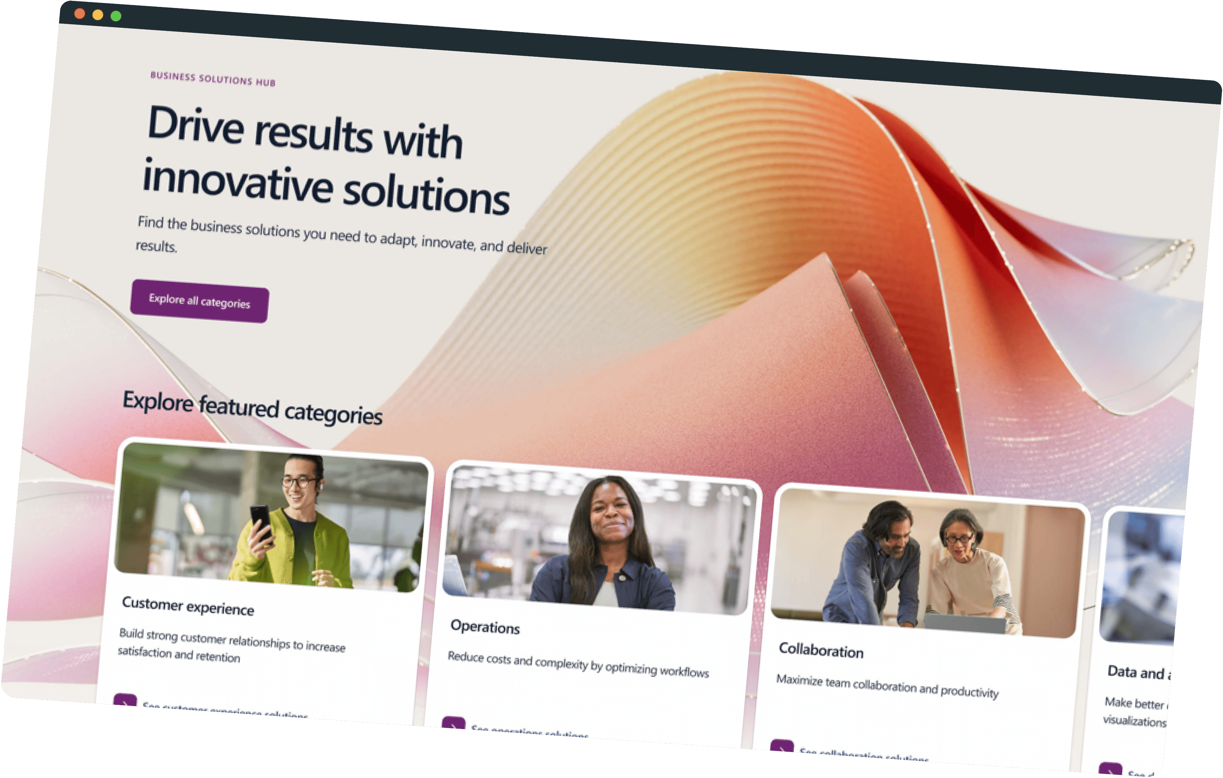
This part involves modernizing Microsoft’s commercial web-pages while strictly adhering to established brand guidelines. The primary challenge was to simplify complex user flows for a diverse audience, improve accessibility without sacrificing visual quality, and align multiple stakeholder expectations with user-centered design goals. The solution focused on streamlining navigation, clearly highlighting key products, and establishing a cohesive design language across all pages. This approach resulted in a more intuitive, accessible, and consistent user experience while maintaining brand integrity.
🏹 Methodology
Due to NDA, I can't disclose the specific details of each of my project publicly. On a high-level, Our redesign focused on simplifying navigation, highlighting key products, and creating a cohesive design language across all pages adhering to strict brand guidelines, that empowers Microsoft with new tools for marketing products more effectively.
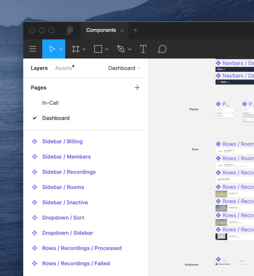
To ensure the redesigned webpages adhered to Microsoft's branding and design guidelines, I utilized the Reimagine Design System, a robust library of components and patterns.
Component Utilization:
Incorporated reusable components like navigation bars, buttons, cards, and typography styles from the Reimagine system to maintain design consistency across all pages.
Scalability:
Leveraged the system's flexibility to create designs that were scalable and adaptable for future updates.

Collaboration:
Worked closely with content strategists and developers to align templates with the technical and content requirements.

Accessibility Standards:
Ensured all design decisions followed accessibility guidelines (WCAG) embedded in the design system, creating inclusive experiences for all users.

🎯 What we Achieved in Commercial
Today, Microsoft can adapt to market trends in real-time, ensuring a consistent brand experience across its expansive web presence.
Improved average time on page
Increased call-to-action click-through rate
Reduced bounce rate
💫 Our Beautiful Outcome





Consumer
Creating a Seamless Digital Experience for Consumers
🧞♂️ Reshaping of Consumer pages
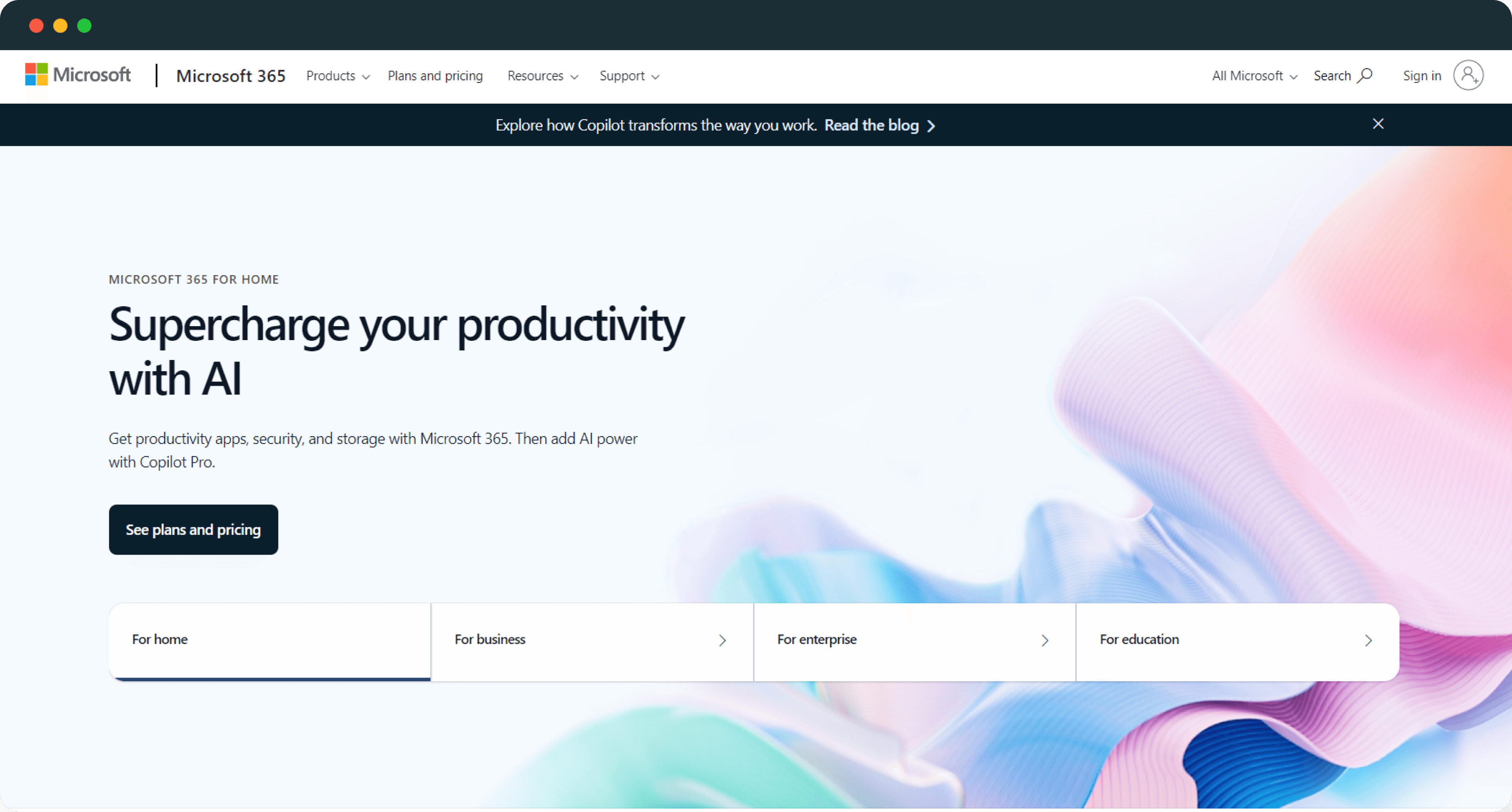
In the consumer space, we reimagined key high-engagement webpages with a focus on AI-driven experiences, highlighting Microsoft Copilot as a core offering. The redesign emphasizes clarity, engagement, and intuitive interactions, helping users better understand and adopt AI-powered features across Microsoft’s consumer ecosystem.
🧭 Where we started?
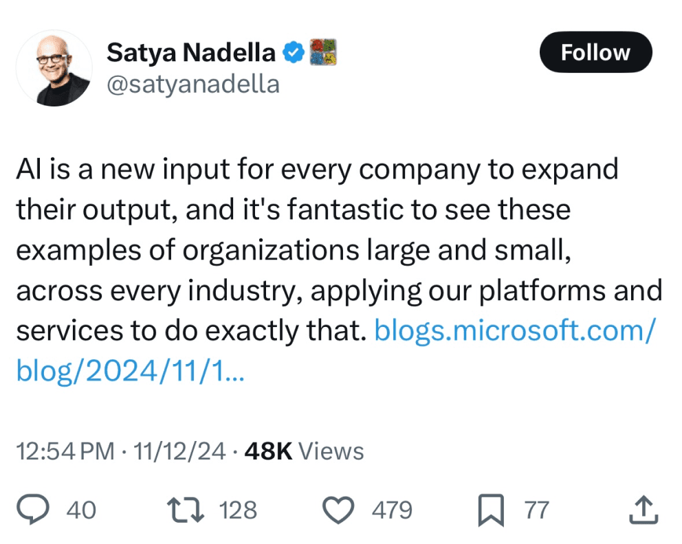
Microsoft’s consumer AI journey is strongly driven from the top. Satya Nadella has consistently positioned AI as a defining technology—one that should augment human creativity, productivity, and everyday life. His public statements, social posts, and keynote messaging repeatedly emphasize making AI trustworthy, accessible, and deeply embedded into products people already use.
The visual references highlight Microsoft’s sustained investment and leadership focus on AI across platforms—Copilot, Windows, Surface, and cloud ecosystems. This leadership vision set the foundation for our project: framing AI not as a standalone feature, but as an integral part of the consumer experience, especially during high-intent moments like the holiday season.


⁉️ What we Choose & Why we Choose
With thousands of pages across Microsoft’s consumer ecosystem, identifying the right pages to focus on was the most critical challenge. We began our research by evaluating which pages would deliver the highest user and business impact. This approach helped us prioritize high-traffic, high-intent pages where design improvements and AI integration could meaningfully influence user engagement and decision-making.
🧿 Observations - Mapping it out in Excel
Microsoft's main navigation drop-down menus, particularly the "Products" menu, contain an overwhelming amount of information and links without providing context. Users must click into each product to understand its purpose, which leads to a frustrating and inefficient browsing experience.

💁🏻♀️ User Journey
Following our users web navigation click-by-click


🎨 Branding
While analyzing the user flows, we identified two distinct brand contexts that needed to be addressed: Copilot and Windows. Each represents a different experience layer within Microsoft’s ecosystem. To ensure consistency and clarity in further design implementation, we studied and documented the brand principles, visual language, and interaction patterns of both products before applying them across the redesigned pages.
Copilot
Light, approachable color palette
The new Copilot branding embraces a light, approachable color palette that enhances clarity and accessibility across its webpages. Soft blues, greens, and oranges are approachable and friendly. The brand also employs high contrast moments to draw attention to key areas effectively.
Rounded Edges
The Copilot brand reinforces its friendly and user-centric design through the use of rounded edges on key UI elements. Buttons, cards, and containers feature smooth, softened corners that create a more inviting and modern aesthetic. This design choice not only enhances visual harmony but also contributes to a sense of accessibility and ease of use.
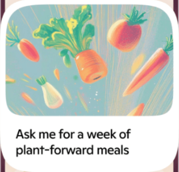
Floating Elements
The Copilot brand's use of floating, grid-breaking elements serves to create a sense of fluidity, motion, and innovation—key themes associated with AI-powered assistance.
By breaking away from rigid, structured layouts, these design elements convey a more dynamic and adaptive experience, reflecting how Copilot seamlessly integrates into users' workflows. This approach also helps draw attention to key content, guiding the eye in a more engaging and organic way.
Additionally, floating elements introduce a sense of depth and layering, making the interface feel more interactive and modern while reinforcing the brand’s forward-thinking identity.

Colors
Rounded edges
Floating Elements




Superpowers

Windows

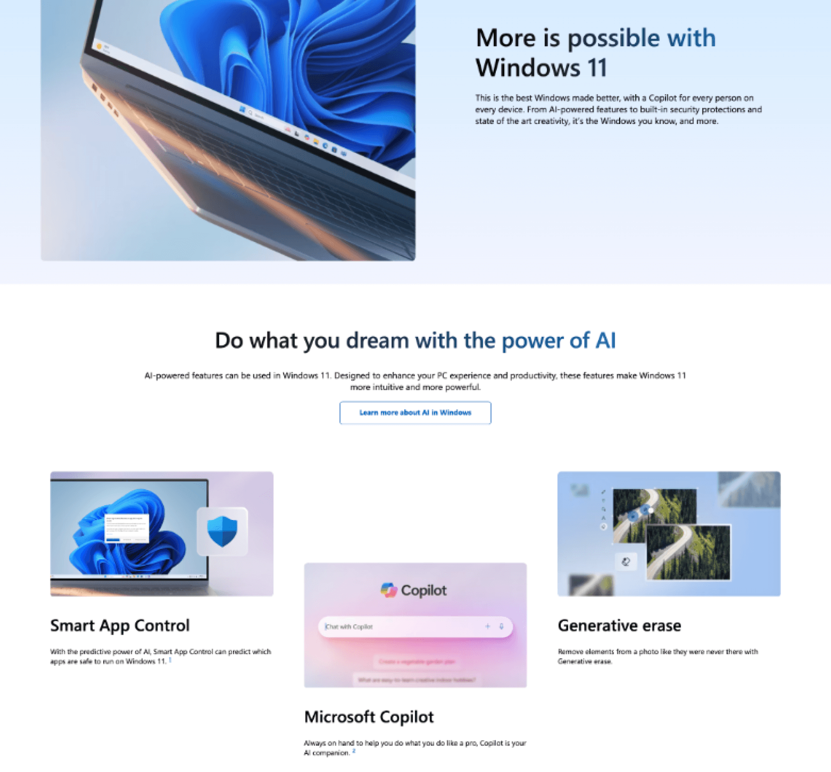
Minimal Radius Edges
The Windows brand emphasizes clarity and precision through the use of minimal-radius edges across its UI components. Buttons, panels, and containers feature subtle corner rounding that maintains a clean, structured, and functional aesthetic.
This restrained use of radius supports consistency, improves content legibility, and reinforces Windows’ focus on efficiency, familiarity, and system-level reliability.
Subtle Color and Gradients
The Windows brand uses a light and subtle blue color palette to reinforce familiarity, trust, and system-level consistency. Soft blue tones are applied sparingly to maintain a clean and unobtrusive visual experience. Gradients are introduced in a controlled manner to add depth and enhance visual representation, helping highlight key sections without overpowering the content.
Minimal Radius Edges
Color

🛍️ Research on Shopping Experience
Our research focused on how different platforms integrate Microsoft Copilot branding within their shopping experiences and how users perceive these transitions while browsing, learning, and purchasing.
Across competitors, we observed that the key differentiator lies in how branding intensity changes throughout the user journey. Each platform follows a distinct “concept curve” that reflects how much the experience leans into Copilot’s identity versus the parent brand at different stages.

The research highlights that high-impact experiences occur when branding intensity peaks during moments of curiosity and discovery, but clarity and trust are preserved when the UI returns to a familiar structure for decision-making.
📊 Concept curve - Determining the Brand Direction
To ensure consistency in our UI and brand direction across different webpages, we created a graph that mapped each page to either the new Copilot branding or the original Reimagine branding. This visual representation allowed us to assess alignment with Microsoft's evolving design language, ensuring a cohesive user experience.
By plotting key UI elements, color schemes, typography, and interaction patterns, we identified which branding style best suited each page based on its purpose and audience. This approach provided a clear framework for decision-making, helping us maintain brand integrity while modernizing the interface.

💫 Our Beautiful Outcome
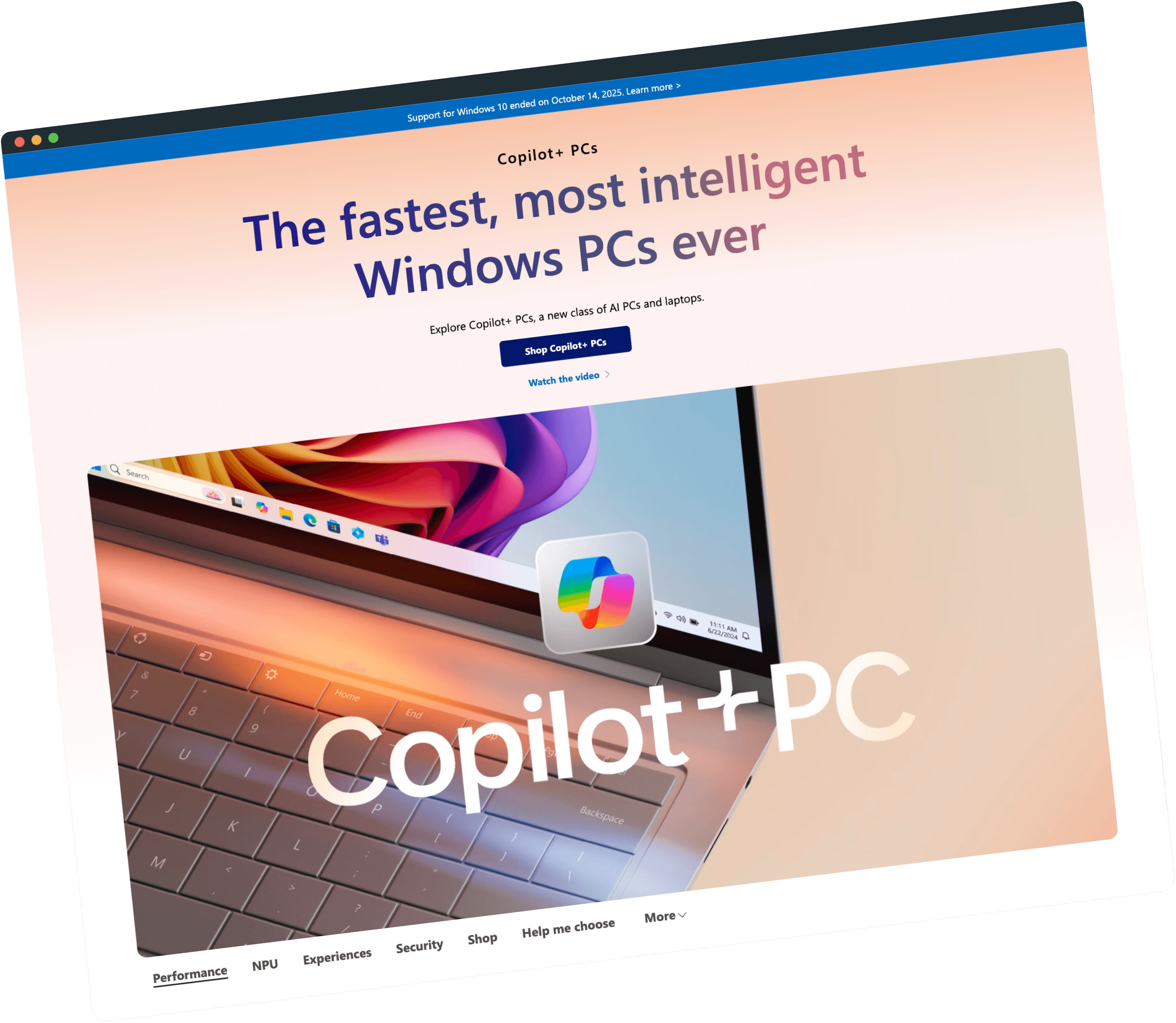
Old version
(before Reimagine)

New version
(after Reimagine)
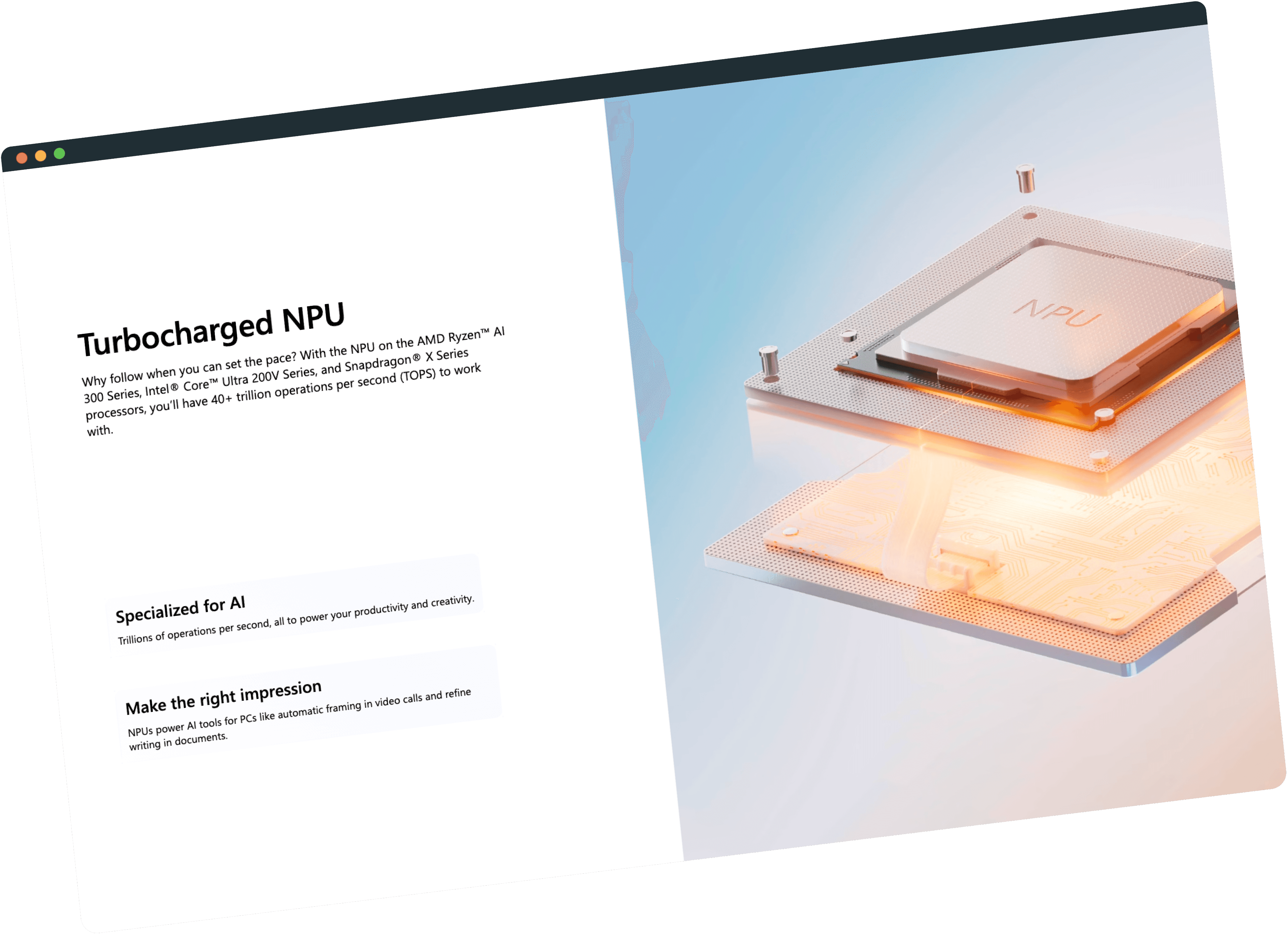
Old version
(before Reimagine)

New version
(after Reimagine)

Old version
(before Reimagine)

New version
(after Reimagine)

Old version
(before Reimagine)

New version
(after Reimagine)

Old version
(before Reimagine)
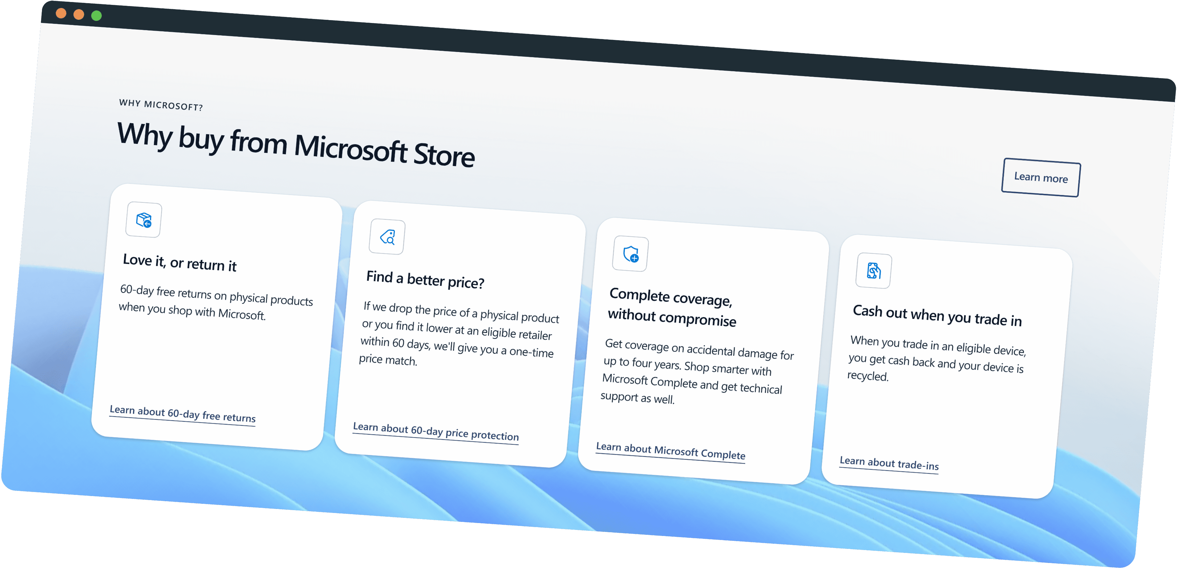
New version
(after Reimagine)
Crafting Experience that feel Effortless to be in
Have an Idea for a Product? Mail me at
Copyright @ Portfolio by Ram
Ramakrishnan Santhanam